
When renovating or refreshing a home, most people focus on wall colour, flooring, or kitchen finishes. But one of the most powerful design decisions — and one of the most overlooked — is the colour of your trim.
If you’ve ever walked into a room that felt slightly flat or “developer-basic,” chances are the architrave colour played a role.
Choosing the right trim colour can:
- Make ceilings feel higher
- Create contrast and architectural interest
- Tie together oak doors and flooring
- Soften or sharpen a cream colour scheme
- Elevate the entire finish of your home
In this guide, we’ll answer the most common questions Irish homeowners ask:
- What colour to paint architraves?
- What colour architrave with oak doors?
- Should you choose white or cream?
- What works with black windows?
- What are modern trim colour trends in Ireland for 2025?
This is the design-conscious homeowner’s guide to getting trim colour right.
Should Architraves Always Be White?
For decades, white architraves have been the default choice in Irish homes. But is white always the best option?
Why White Became the Default
White trim became popular because it:
- Suits traditional Irish interiors
- Maximises light in smaller rooms
- Creates a clean frame around doors
- Feels safe and neutral
In older homes especially, white architrave paired with white ceilings became standard practice.
When White Works Best
White architraves are ideal for:
- Bright, modern interiors
- Minimalist homes
- Cool grey or neutral wall schemes
- Spaces with limited natural light
A crisp white trim can create a sharp, contemporary contrast against muted walls.
When White Can Look Too Harsh
However, bright white isn’t always flattering.
It can feel stark when paired with:
- Warm beige or cream walls
- Period homes with softer palettes
- South-facing rooms with strong sunlight
- Warm oak doors and flooring
In these settings, bright white can create too much contrast and feel visually disconnected.
The key takeaway? White isn’t the only option.
White vs Off-White – Which Is Better for Irish Homes?
If you’re wondering what colour to paint architraves, the real decision often comes down to bright white versus warmer off-white.
Pure White (Bright Modern Finish)
Best for:
- Grey walls
- Contemporary interiors
- High-contrast schemes
- Homes with black windows
Pros:
- Crisp and clean
- Reflects maximum light
- Feels modern
Cons:
- Can feel cold in north-facing rooms
- May clash with warm creams
Off-White (Warmer Tones)
Off-white includes soft warm whites with subtle cream or beige undertones.
Best for:
- Cream walls
- Period properties
- Traditional interiors
- Oak doors and timber floors
Pros:
- Softer and more cohesive
- Less visual harshness
- Works beautifully in Irish natural light
Cons:
- Less dramatic contrast
How Lighting in Ireland Affects White
Ireland’s natural light tends to be:
- Overcast
- Soft and diffused
- Cooler in north-facing rooms
Stark white can appear bluish or cold under grey skies.
Design tip: Always test trim samples in both daylight and evening lighting before committing.
What Colour Architrave with Oak Doors?
This is one of the most searched design questions — and for good reason.
Oak doors are warm, textured, and naturally rich. The wrong trim colour can either overpower or dull them.
Here are three strong options.
Option 1: Classic White with Oak Doors
This creates strong contrast and keeps the room feeling bright.
Best for:
- Painted skirting
- Neutral walls
- Modern renovations
Pros:
- Fresh and clean
- Highlights the oak grain
- Keeps interiors light
Cons:
- Can feel too sharp in cream schemes
Option 2: Warm Off-White with Oak
A warmer white softens the transition between oak and trim.
Best for:
- Cream walls
- Traditional interiors
- Period homes
Pros:
- Balanced and cohesive
- Less harsh contrast
- Warmer overall feel
Cons:
- Slightly less modern in appearance
Option 3: Matching Tone Approach
For a contemporary look, some homeowners paint architraves in a tone close to the oak itself.
Best for:
- Contemporary interiors
- Colour-drenched schemes
- Minimalist design
Pros:
- Seamless look
- Subtle and refined
- Reduces visual interruption
Cons:
- Less definition around doors
There’s no single “correct” answer — it depends on the overall mood you want to create.
Modern Contrast Trim – The 2026 Trend
If you’re browsing Pinterest for architrave colour ideas, you’ll notice a shift in 2025.
Contrast trim is growing in popularity across Irish renovations.
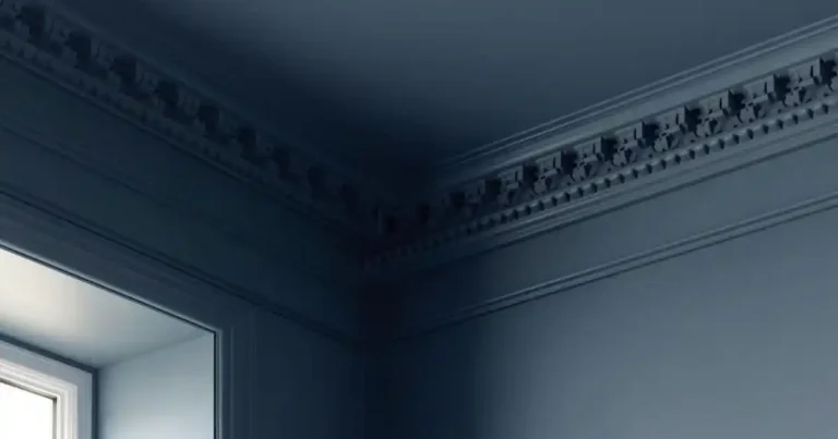
Dark Architrave (Charcoal or Soft Black)
Dark trim creates a dramatic framing effect.
Works best with:
- Black windows
- Light neutral walls
- Modern classic interiors
This approach feels architectural and high-end.
However, darker trim requires strong profile detail to avoid looking flat.
Same Colour as Walls (Colour-Drenching)
Painting architrave the same colour as the walls creates a seamless, modern look.
Benefits:
- Makes ceilings feel higher
- Creates calm flow between rooms
- Works beautifully in boutique-style renovations
This is increasingly popular in high-end Dublin extensions.
Two-Tone Rooms
Some homeowners use contrast architrave for:
- Feature doorways
- Statement rooms
- Hallways
Used carefully, this creates strong visual interest.
What Colour Architrave with Cream Walls?
Cream walls remain popular in Irish homes — but they require careful trim pairing.
Crisp White + Cream Walls
Creates a noticeable contrast.
Best for:
- Bright spaces
- Homes with strong natural light
Be careful: cool white with warm cream can clash.
Warm White + Cream
This is often the safest and most elegant choice.
- Softer transition
- More traditional
- Comfortable and cohesive
Matching Cream Exactly
For a calm and seamless effect, match trim exactly to wall colour.
This works well in:
- Smaller rooms
- Open-plan spaces
- Homes aiming for subtle elegance
Designer tip: Never mix cool whites with warm creams — undertone mismatch is immediately noticeable.
What Colour Architrave with Black Windows?
Black-framed windows are increasingly popular in Irish extensions and modern builds.
They introduce strong contrast — which affects trim choices.
Black Architrave for Dramatic Effect
Creates bold framing and architectural presence.
Best for:
- Large, bright rooms
- Modern classic interiors
Avoid in small, dark spaces where it can feel heavy.
White Trim + Black Windows
A balanced approach.
- Keeps brightness
- Maintains contrast
- Prevents over-darkening
Matching Wall Colour Instead
A subtle option.
Let the windows provide the drama while trim blends into the walls.
This keeps the overall scheme calm.
Should Skirting and Architrave Be the Same Colour?
In most Irish homes, matching skirting and architrave creates cohesion.
Matching works best when:
- You want symmetry
- The room is traditional
- You’re aiming for timeless design
Subtle variation can work in modern interiors — but consistency usually feels more intentional and refined.
Gloss, Satin or Matte? (Finish Matters)
Colour choice is only half the story — finish changes the look dramatically.
Gloss
- Traditional
- Highly reflective
- Durable
- Easy to wipe clean
Satin
- Soft sheen
- Modern classic feel
- Popular in contemporary Irish homes
Matte
- Contemporary
- Understated
- Works well in colour-drenched schemes
For most renovations, satin offers the best balance between elegance and durability.
Common Colour Mistakes to Avoid
Avoid these frequent issues:
- Using stark white in a warm scheme
- Mixing undertones (cool white + cream walls)
- Over-contrasting in small rooms
- Ignoring how natural light changes colour
- Choosing colour without considering profile thickness
Trim colour should enhance — not compete.
Colour & Proportion – Why Profile Choice Still Matters
Even the perfect colour can look underwhelming if the architrave profile lacks definition.
A sharp, well-proportioned profile:
- Creates deeper shadow lines
- Carries darker colours more confidently
- Elevates contrast schemes
Thin, flat MDF trim often looks dull when painted bold or dark.
Chunkier, well-detailed mouldings perform better visually — especially with modern contrast trends.
FAQs
The Right Colour Deserves the Right Profile
Even the perfect paint colour won’t look refined if the trim itself lacks definition.
Premium, paint-ready architectural mouldings:
- Hold colour beautifully
- Create clean shadow lines
- Elevate contrast schemes
- Deliver long-term durability
If you’re updating your interior finish, pairing the right colour with the right profile makes all the difference.
👉 Shop Paint-Ready Architrave Profiles
- Designed for modern Irish interiors
- Ideal for oak doors and cream walls
- Sharp European detail
- Moisture-resistant
- Trusted by designers and trade professionals
Because in well-designed homes, the details don’t just blend in — they elevate everything around them.