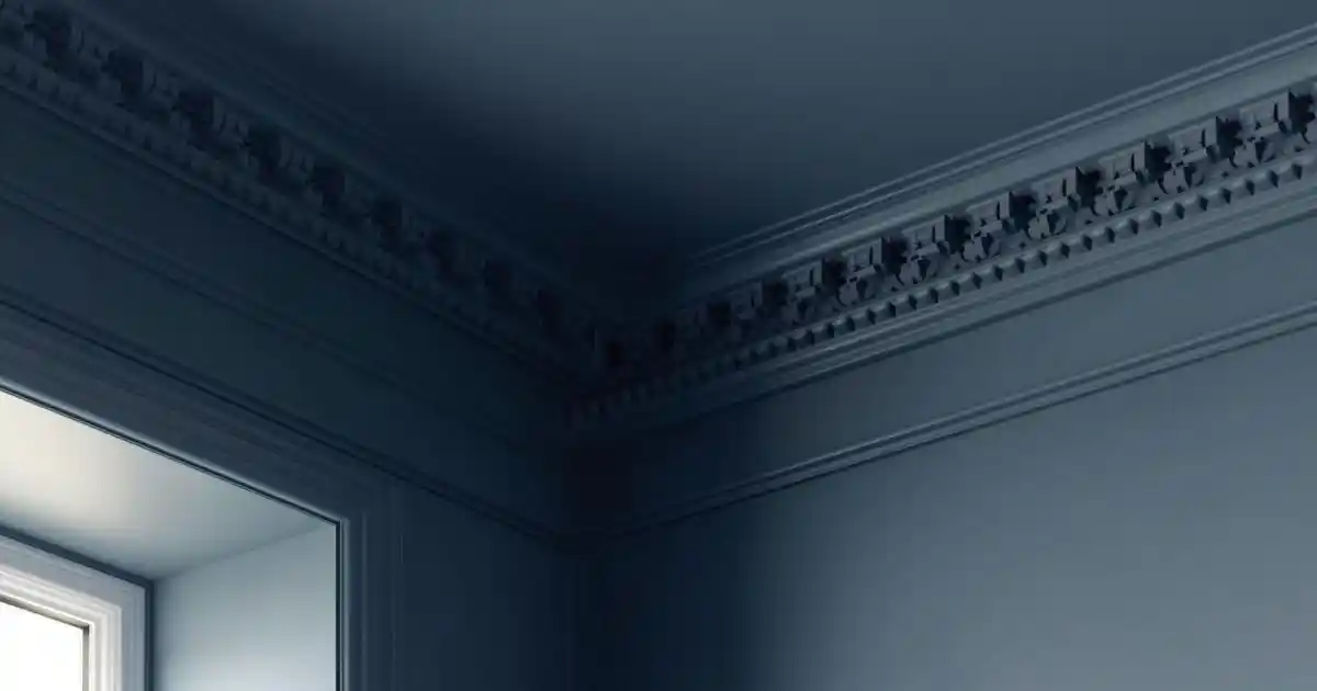
Choosing whether your cornice should match the ceiling or stand out in a different colour might seem like a small decision—but it has a big visual impact. This choice affects how tall a room feels, how seamless the finish looks, and how forgiving the final result is once everything is painted.
This design-led guide is written for homeowners, designers, and trades who want to make a confident, intentional decision—one that suits the space, the cornice profile, and the level of finish achieved.
Why This Colour Decision Matters More Than People Think
Cornice sits at the most visually sensitive junction in a room: where wall meets ceiling.
Your colour choice directly affects:
- Ceiling height perception (rooms can feel taller or lower)
- Visual flow between walls and ceiling
- How noticeable joins, gaps, and imperfections become
There is no single “correct” answer. The right choice depends on the room, the cornice style, and how clean the installation is.
👉 For full painting context, see: How to Paint Cornice for a Crisp, Professional Finish
The Two Main Approaches Explained
At a high level, there are two options:
- Painting cornice and ceiling the same colour
- Painting cornice a different colour to the ceiling
Professionals choose between these based on ceiling height, profile style, and desired visual impact.
Painting Cornice and Ceiling the Same Colour
Why This Is the Most Popular Choice
This approach dominates modern interiors because it:
- Creates a seamless transition
- Reduces visual breaks at the ceiling line
- Makes rooms feel taller, calmer, and more spacious
- Keeps attention on the architecture, not the paintwork
It’s especially effective in contemporary and minimalist spaces.
When Same-Colour Works Best
- Low or standard ceiling heights
- Modern or minimalist interiors
- Smaller rooms
- Kitchens and open-plan spaces
In these settings, continuity matters more than contrast.
Practical Benefits
- Hides minor joins or imperfections
- Faster, simpler painting process
- Easier to repaint in the future
- More forgiving for DIY projects
This is often the safest and most flexible choice.
Painting Cornice a Different Colour to the Ceiling
When Contrast Works Well
Contrast can look stunning—but only in the right context:
- Period or traditional interiors
- Rooms with generous ceiling height
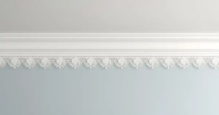
- Decorative or ornate cornice profiles
- Feature rooms such as dining rooms or formal living spaces
Here, the cornice becomes part of the room’s character.
Popular Contrast Options
- White cornice with a coloured ceiling
- Cornice painted to match the wall colour
- Subtle tone-on-tone contrasts (off-white vs white)
Subtlety is usually more successful than bold contrast.
Risks of Contrast
- Highlights joins, gaps, and uneven lines
- Draws attention to imperfections
- Requires much more precise painting
If the finish isn’t perfect, contrast will make sure you notice.
How Cornice Profile Style Affects Colour Choice
Plain & Modern Cornice
- Best suited to same-colour schemes
- Emphasises clean lines and simplicity
- Lets form and proportion do the work
Most modern profiles are designed to disappear quietly rather than shout for attention.
Decorative & Ornate Cornice
- Can benefit from contrast to highlight detail
- Detail visibility depends heavily on paint technique
- Higher risk if overpainted or poorly finished
👉 Technique guide: How to Paint Decorative Cornice Without Losing Detail
How Ceiling Height Influences the Decision
- Low ceilings: same colour avoids visual breaks and keeps height
- High ceilings: contrast can add definition and character
Colour placement changes how we perceive proportions more than most people realise.
Cornice Colour Choices in Modern Irish Homes
Current trends lean strongly toward:
- White-on-white finishes
- Soft neutral ceilings (warm whites, light greys)
Modern mouldings—like those from Gaudi Coving—are designed to work beautifully with minimalist colour schemes, where crisp profiles matter more than colour contrast.
Timeless choices usually outperform trend-led ones.
Kitchens, Bathrooms & Open-Plan Spaces
These spaces benefit from restraint.
- Same-colour schemes feel cleaner and more cohesive
- Moisture-prone rooms benefit from consistent paint finishes
- Open-plan layouts look calmer with visual continuity
In kitchens especially, cornice should support the cabinetry—not compete with it.
Painting Cornice and Ceiling Together vs Separately
Painting Together
Pros
- Seamless finish
- Forgiving of small imperfections
- Faster and simpler
Cons
- Less visual emphasis on cornice
Painting Separately
Pros
- Greater control over contrast
- Highlights decorative detail
Cons
- Requires masking or careful cutting-in
- Higher skill requirement
- Mistakes are more visible
Professionals choose this only when the finish quality supports it.
Common Colour-Choice Mistakes (And How to Avoid Them)
- Choosing contrast without perfect joins
- Using high-gloss finishes unnecessarily
- Ignoring ceiling height
- Making cornice the focal point unintentionally
When in doubt, simplicity usually wins.
DIY vs Professional Advice on Cornice Colour
DIY-Friendly Choices
- Same colour as ceiling
- Neutral tones
- Modern, plain profiles
When Professional Input Helps
- Bold or dark colour schemes
- Ornate or large-profile cornice
- Period-style interiors
Knowing when to keep it simple is part of good design judgment.
Frequently Asked Questions About Cornice Colour
Final Tips for Choosing the Right Cornice Colour
- Consider ceiling height first
- Match colour choice to profile style
- Be realistic about finish quality
- When in doubt, keep it simple
- Let architecture—not paint—do the work
Final Thoughts: The Best Choice Is the One That Looks Intentional
- Same colour = clean, modern, forgiving
- Contrast = expressive, traditional, demanding
Cornice should enhance the room, not compete with it. Modern mouldings are designed to look their best when colour decisions are deliberate and restrained—not overworked.
That’s why many Irish interiors rely on paint-ready profiles from Gaudi Coving—engineered to finish crisply whether you choose seamless simplicity or carefully executed contrast.